Reviewing CSS Container Queries
Media queries respond to the viewport. Container queries respond to the parent element. That distinction changes everything about how you build responsive...
3 May 2024
Media queries respond to the viewport. Container queries respond to the parent element. That distinction changes everything about how you build responsive components.
With media queries, a card component looks the same whether it's in a wide main content area or a narrow sidebar -- unless you write special overrides for each context. Container queries let the card adapt to its container, not the screen.
How it works
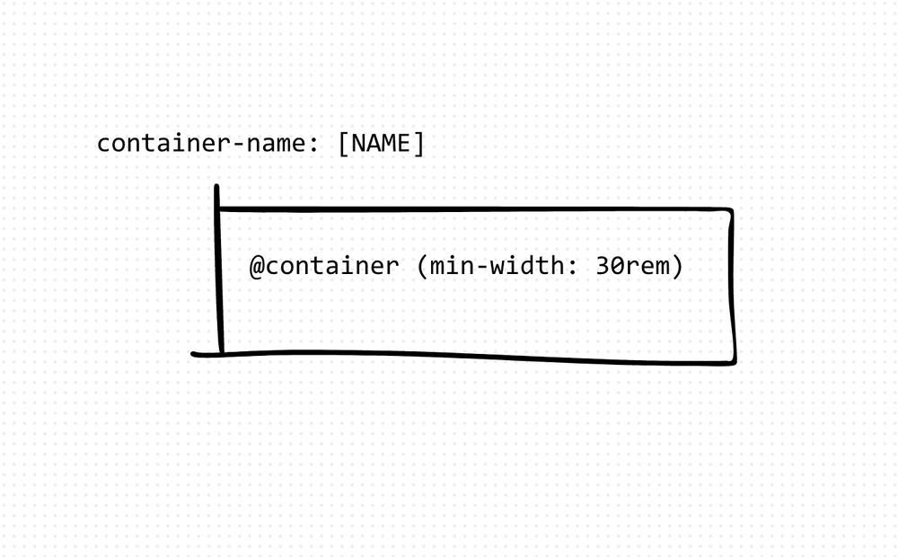
First, declare an element as a container:
.card-wrapper {
  container-type: inline-size;
  container-name: card;
}
Then write styles that respond to that container's dimensions:
@container card (min-width: 30rem) {
  .card {
    display: grid;
    grid-template-columns: 1fr 2fr;
  }
}

@container card (max-width: 30rem) {
  .card {
    display: flex;
    flex-direction: column;
  }
}
When the .card-wrapper is wider than 30rem, the card uses a grid layout. When it's narrower, it stacks vertically. This works regardless of the viewport width.
Why this matters
I've built design systems where the same card component appears in dashboards, sidebars, modals, and full-width pages. With media queries, I needed breakpoint-specific overrides for every context. With container queries, the card handles it on its own.
This makes components truly portable. Drop them anywhere, and they adapt.
The trade-offs
Container queries require you to explicitly set container-type on the parent. This means you need to think about containment -- which elements are containers and which are not. It's another layer of CSS architecture to manage.
Performance is also worth considering. Container queries add layout recalculation work. For most use cases, it's negligible. For deeply nested container query hierarchies with many breakpoints, it could add up.
Browser support is now solid across Chrome, Firefox, Safari, and Edge. But if you're supporting very old browsers, you'll need a fallback strategy (media queries as a baseline, container queries as progressive enhancement).
When to use them
Use container queries for reusable components that appear in multiple layout contexts. Cards, widgets, form groups, navigation items -- anything that needs to adapt to its parent rather than the screen.
Keep media queries for page-level layout decisions: how many columns the main grid has, whether the sidebar is visible, when to switch from desktop to mobile navigation. Both tools solve different problems. Use both.
Production-Ready Systems with LLMs and Agents
A live Maven cohort, 5 October to 2 November: eight 90-minute sessions where you build LLM and agent systems that survive real traffic, real cost and real failure. Tuesdays and Thursdays, 7:30 to 9:00pm London.
Cohort 2 starts 5 October. Eight live sessions, $1,500.
View the live cohortKeep reading
- React 19 Performance Secrets, Concurrent Rendering, Suspense & Real Tips
- Lazy Loading in HTML and CSS: Enhancing Performance and User Experience
- Edge Rendering with Next.js and Cloudflare Workers
- Rolling Out an Internal UI Component Library
- What is a Design System According to Atlassian?
- CSS Houdini: New Possibilities for Your CSS